Monday, 17 November 2014

Colour Association

Different colours can show different feelings and emotions, a certain colour can demonstrate how you are being perceived. For example I would say red has a few connotations, one is that red shows signs of danger however it can also be used to convey romance and love. Blue is seen as a relaxing colour, it can make people feel comfortable in their surroundings. Many themes of spa's are blue. Colours such as yellow, green and pink can be very bright and for me they depict happiness and a light hearted nature. The colour green is the colour of nature, I would also link it to recycling and making the world more eco-friendly. Colours such as grey and white are quite plain which in my opinion have no attached feelings or meanings because they can be shown as 'dull'.


Here I have arranged some coloured pens into the style of a colour wheel, by doing this I have gained a better understanding of how the colours look when they are put next to each other. For example, colours opposite each other are complimentary and some are contrasting due to their positioning in the colour wheel. 
This is a collage of pictures I took last week when I was walking around Bath, I took pictures of objects ranging from clothes to doors. I have arranged this in the form of the colour wheel. 


Primary Colours are those that are formed by mixing any other colours, some say they are pure colours. Secondary are formed by mixing two or more primary colours together and tertially by mixing two or more secondary colours. 

Tetradic Colour Scheme 
This colour scheme uses four colours arranged into two complementary colour pairs. This scheme is hard to harmonise; if all four colours are use in equal amounts, the scheme may look unbalanced, so you should choose a colour to be dominant or subdue the colours. 

Triadic Colour Scheme 
This colour scheme uses three colours equally spaced around the colour wheel. It offers strong visual contrast while retaining balance, and colours richness. The triadic scheme is not is not as contrasting as the complementary scheme, but it looks more balanced. 


Complementary Color Scheme 
This is made of two colours that are opposite each other on the colour wheel, the complementary scheme is intrinsically high-contrast and draws maximum attention. Using one colour for the background and its complementary colour to highlight important elements, you will get colour dominance combined with sharp colour contrast. 
Analogous Colour Scheme 
Analogous colour are colours that are in close proximity of each to each other on the colour wheel that share similar hue and saturation. The graphic example below shows red and two analogous colours of red violet and red orange. Analogous colours are most often used to achieve proper colour harmony. 

Sunday, 16 November 2014

Art Forms

Postmodern

PostmodernI in general, included movements such as Intermedia, Installation art, Conceptual Art and Multimedia, particularly involving video are described as postmodern. Dates that have been proposed as marking the beginning of the postmodern movement include 1914 in Europe and 1962 or 1968 in the United States.  Postmodern art tends to deconstruct traditional narratives of race, gender, nationality and family. 


Futurism Art


Futurism  was an artistic and social movement that originated in Italy in the early 20th century. It emphasized and glorified themes associated with contemporary concepts of the future, including speed, technology, youth and violence. It was largely an Italian phenomenon, though there were parallel movements in Russia, England and elsewhere.  The Futurists practised in every medium of art, includingpainting, sculpture, ceramics, graphic design, industrial design, interior design, urban design, theatre, film, fashion, textiles,literature, music, architecture and even gastronomy.


Art Nouveau


Art Nouveau is considered a "total" art style, embracing architecture, graphic art, interior design, and most of the decorative arts, including jewellery, furniture, textiles, household silver and other utensils and lighting, as well as the fine arts. According to the philosophy of the style, art should be a way of life. In the 19th Century, it was inspired by natural forms and structures, not only in flowers and plants, but also in curved lines. 


Swiss Style


Swiss Style, is a graphic design style developed in Switzerland in the 1950s that emphasizes cleanliness, readability and objectivity. The style is also associated with a preference for photography in place of illustrations or drawings. Fonts chosen for the text are sans serif. Many early pioneers of the movement believing that design is a “socially useful and important activity... the designers define their roles not as artists but as objective conduites for spreading important information between components of society.”

Bauhaus

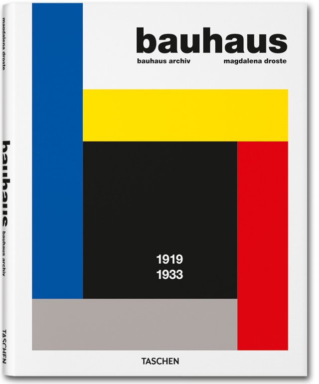
Bauhaus, was an art school in Germany that combined crafts and the fine arts, and was famous for the approach to design that it publicised and taught. It operated from 1919 to 1933. The Bauhaus was first founded by Walter Gropius. The school existed in three German cities: Weimar from 1919 to 1925, Dessau from 1925 to 1932 and Berlin from 1932 to 1933. Changes of venue and leadership resulted in a constant shifting of focus, technique, instructors, and politics.

Thursday, 13 November 2014

Recce


We walked to two different places looking for a setting for a romantic, comedy and sci-fi film. The first location was in a park, it had a lot of slopes which would allow us to get some good shots however I wasn't blown away by the surrounding, it wasn't much of an open space and it was very crowded with the play equipment. I don't think this location would've been entirely suitable for the film. In this particular location, the road was visible and could get quite busy, I think the traffic going past can have an impact on the scene and possibly be harder to work around.

The second location we went to was a lot better in my opinion because it was more of an open space, I think that a plain area would be more effective because it allows us to be more creative with our ideas. There were also a few slopes which would allow us to get some good shots from different angles. This area was quite tucked away despite having a row of outstanding buildings surrounding it, I believe this makes the set more gloomy and suitable to the film.

Both of the locations we went to were near building work which may not be suitable for the film because if we take time to discuss the shots in the middle of filming, the surrounding could have completely changed which could possibly make it look unrealistic.

Mini Research Project

Textual Analysis
I have chosen to use an album as part of my research project. The album I will be focusing on is ‘Neighborhoods’ by blink-182. Neighborhoods is a 36 minute long alternative rock/pop punk album, it was released on September 27, 2011. This is their first album in eight years, its recording followed the band's breakup and reconciliation. The trio wrote lyrics regarding such subjects as isolation, confusion and death. The band infused inspiration from each member's various musical tastes to form a unique sound that recalled their separate upbringings, leading the trio to compare the album to separate neighborhoods.

Genre

I have decided to choose this album to do my research project on because I believe it has a lot of hidden meanings behind it which are interesting to look into. The genre of this album is the type of the genre I am interested in. Blink-182 produce a very specific genre which is alternative rock/pop punk, a band such as blink-182 know exactly what type of music to write and perform for their audience as they are very aware of the audience profile.


Representation

The lyricism of the album is majorly influenced by heavy elements in each members lives, elements considered dark by Mark Hoppus (bassist/vocalist). The band wrote lyrics  dealing with breakdowns in communication and trust and tackled with themes of isolation, confusion, depression, addiction and loss. Mark Hoppus struggled with writing upbeat, happy songs for the album and attributed to dark lyricism to the heavy events occurring shortly before the reunion.

For example, I focused on one song on the album called ‘After Midnight’. The lyrics are centred around romance. The song revolves around two broken individuals who fall in love. The music video to this was released in January 2012, it combines a narrative of young lovers sneaking around a youth psychiatric ward and performance shots of the band performing.


Introduction to the ‘After Midnight’ music video
The music video begins with a mid shot of the sign saying ‘youth psychiatric ward’ which straight away tells us the idea of the video, the mid shot is used so the audience are able to read the sign clearly. There is then a wide shot to show the teenagers sat in a canteen, the lighting at this point is dimmed, this is used so show the dark atmosphere around the ward. After this there is a close up of different activities the teenages are participating in, each of which have a blank expression on their face hinting that they are distressed. A close up of a boy is used, he looks up a smiles slightly, an over the shoulder shot is followed, showing that he is smiling at a girl across the room, there is then another close up of the girl, the camera zooms into her face slightly demonstrating her realisation of the boy. This allows the audience to understand the main characters of the video. The music the begins as there is a wide shot the blink-182 performing.


Audience
I believe the target audience for this album is mostly teenagers who can possibly relate to the music the band produces. I would not say that I think there is a specific gender because it can relate to a lot of different circumstances that can happen to anyone throughout their life. Personally I am a fan of this album because I think blink-182 are extremely talented musicians and I enjoy the music they make and think the lyrics are inspiring, however I know that a lot of the audience listen to an album such as neighborhoods and use the lyrics as inspiration and it helps them with certain situations that are happening in their personal lives.

Promotion
The band approached sponsorships, song releases and social media incorporation during the roll out of Neighborhoods. Social media such as Twitter and Facebook were present throughout each stage of the release of the album which allowed more direct access and control over the bands music. I think it is good to have a range of different ways to promote an album or any other type of media because focusing on one promotion idea may only target a small group of people so making a variety will reach out.


Packaging


This is the album cover, the front cover is simple yet effective. Blink-182 is  written atop a city skyline. It clearly relates to the name ‘Neighborhoods’. The Neighborhoods sleever contains close family member names to each band member which makes the album more personal.
"Everybody in the world thinks of something unique unto themselves when they hear the word 'Neighborhoods'," Mark Hoppus.
The back lists each song, it includes their record label, a bar code and the blink-182 logo.


Secondary Research
Album: Neighborhoods
Release date: September 27, 2011
Label: Interscope


(Wikipedia)
Neighborhoods was released to mixed reviews from critics: some felt it was a natural evolution from the band's previous releases, while others found it stale and disjointed. The album debuted at number two on the Billboard 200 and "Up All Night" and "After Midnight" were released as singles, with both attracting modest success on Billboard's Alternative Songs chart.
Neighborhoods did not sell as well as previous releases. The band looked back at the album with mixed feelings, for example, Tom Delonge admitted that the album may have been not have been as successful because of the bands previous unity problems.


Critical Responses:
Neighborhoods received generally favorable reviews from contemporary music critics. Mike Diver of BBC Music called the album "unexpectedly great.”


Genre research Project


Soccer Punch Analysis


Pink Analysis

This music video includes characters that are represented in a certain way due to their stereotype, for example at one point Pink is in the gym and she see’s a man walk over to another girl who is wearing less clothing than her so she feels like if she takes her clothes off to reveal more skin she will get the guys attention. The costume she is wearing hints that women will only get noticed if they are half naked. The camera angle at this point is an over the shoulder shot, showing Pinks jealousy.


There is another part of this video where pink goes into the bathroom complaining about the amount of food she had eaten, she is wearing a short pink dress and has a short blonde bob, this insinuates she cares what she looks like and is a ‘girly’ character, she then puts a toothbrush down her throat to make herself sick, this connotes to girls caring so much about their weight that they have to damage themselves.
The two person shot shows the two characters who are both forcing themselves to be sick, there is also a mid shot of Pink looking at herself in the mirror, this is being used to show her sorting out her hair and outfit, this depicts that she feels as though she has to change herself.


At one point in the music video Pink is in a surgery room with pen all over her body showing parts that she will be changing, this suggests that girls don’t think that they are good enough therefore they reduce, enlarge or get rid of parts of themselves to be happy with their appearance. A birds eye view shot is being used in this scene, it is being used to show the whole body and it reveals that pink is changing almost everything about her body.


At one point in the music video, Pink is driving a car and she runs over somebody and all she cares about is her makeup and how she looks, this particular scene suggests some girls are too selfish to care about other people. The character Pink is representing could be referred to as ‘dumb’ or ‘stupid’ which relates to the title of the song ‘stupid girls’. Although this character is not blonde, there is a stereotype that blonde women aren’t as clever, this is not necessarily true however society has made that link.


This music video is being represented in the form of a parody, therefore it is an over exaggerated representation of problems with certain stereotypical views in society. It is showing that some girls are competitive with others girls to be the best they think they could be, the video also says how some women feel like the have to show a certain amount of skin to seek attention.

This music video was created almost completely out of intertextuality, the song and music video for ‘stupid girls’ is referring to different stereotypes of women in society. Many films and tv programs show women acting a certain way because of the way they look or how they have been bought up. Pink is highlighting the judgment and stereotypical views of women in her music video.